Austin Norris

Austin Norris

Principal UX/UI Specialist

Design, Development & Research

SpendHQ

SpendHQ

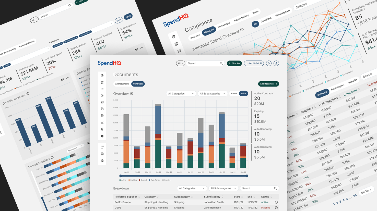
SpendHQ is an all-in-one AI-powered spend intelligence dashboard web app for Fortune 500 companies. It helps them see where their money is going by connecting all of their suppliers and relevant third-party software.

Accomplishments

  • NPS up 133%
  • Product stickiness up 125%
  • Average time spent on site up 50%
  • Re-skin and Re-design of 100s of screens

Problem

SpendHQ had no professional designer before I joined the team, resulting in a dated, inconsistent, and clunky experience and interface. It was my job to lead and redesign the entire user experience and interface to modern design standards.

Solution

Combining data from competitive research, user interviews, and testing, I analyzed user analytics collected through HotJar and Pendo (NPS, stickiness, time on site, retention, and heat mapping). We built personas for users from those needing simple reporting to CEOs who needed detailed data refining and filtering. Our user data and analytics informed my design for a new minimized, cohesive, and modern experience and interface, from scratch.

Full Solution
  1. Audit existing user data, research, and design artifacts
    • Discovered limited user feedback documented, no analytics or design artifacts existed
  2. Coordinated with the head of product, and head of development to setup and implement Pendo and Hotjar for user analytics
  3. Leveraged FigJam to map user flows, create personas, and collaborate on wire-frames before lo-fi or hi-fi design creation
    • Enabled the product owner, stakeholders, business intelligence, and developers to collaborate with us in real time. This gave us massive time savings
  4. Established four main user personas, encapsulating high to low-level financial analysts with varied technical aptitudes with the head of product
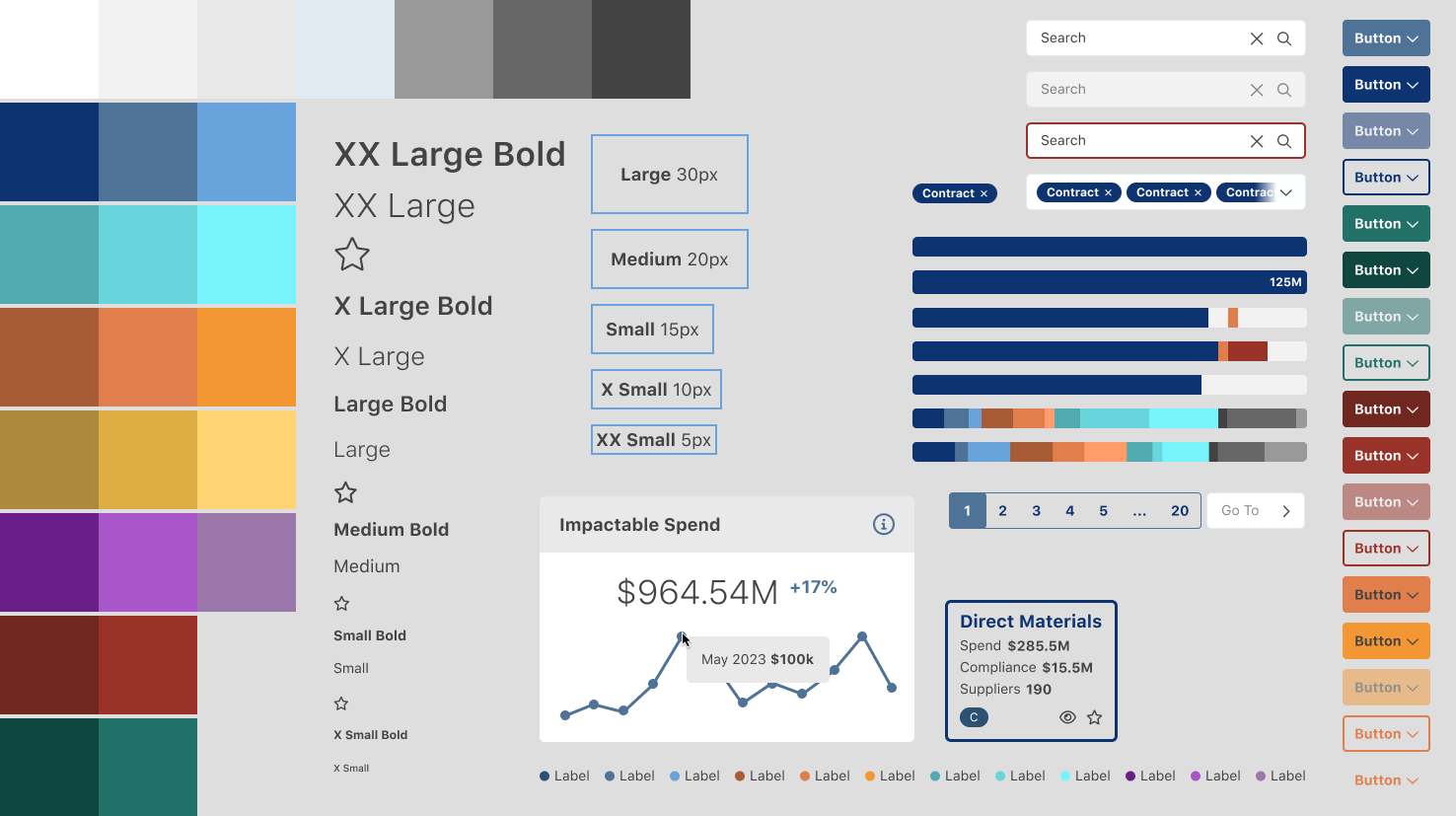
  5. Created a Figma ecosystem from scratch, including a new design system (utilizing atomic design), design file to mirror the 100s of screens in the current app, and a file for the from scratch re-design and it's design system. Design System Assets from design system
  6. Designed and executed user testing with major clients including Pepsi and UnderArmour
  7. Conceptualize and design product enhancements based on user analytics and priority of user need and use amount
    • 10+ major and complex enhancements released in 2 years
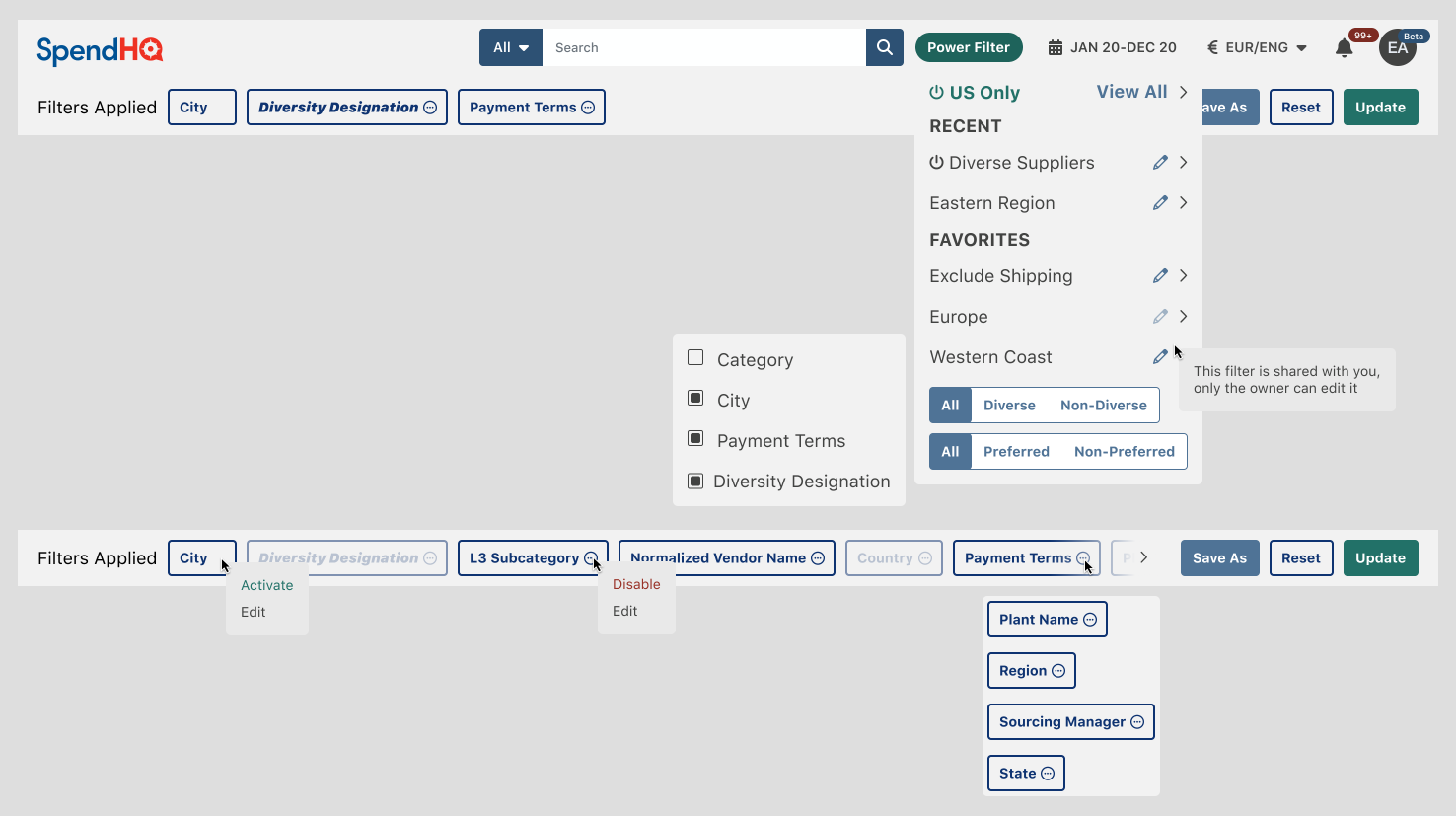
    • Revealed several pain points in a major feature called the power filter. This global control would filter all the data of every screen, thus allowing users to condense the data into a lens digestible to them
    • After redesigning the power filter mostly as a global header compartmentalized element the could be finely tuned on the fly, vs a separate and complex screen, we saw massive improvements in generalized and specific user feedback and time to completion of major goals
    Power FilterPower Filter controls easily accessible from global header component
  8. Created Hi-fi prototypes for user testing
    • We could now test, and iterate on designs without developing actual coded prototypes, saving hundreds of hours of development time
  9. Tested product enhancements using the new analytics tools, leveraging user behavior recordings, contextual feedback, surveys, key metric recordings (session time, stickiness, churn/retention, and NPS scores), and heat mapping
  10. Designed re-skin in tandem of an app re-skin and enhancements
    • Reducing cognitive overload, a major issue with the existing state of the app
    • Removing inconsistencies between components and screens in UX and UI
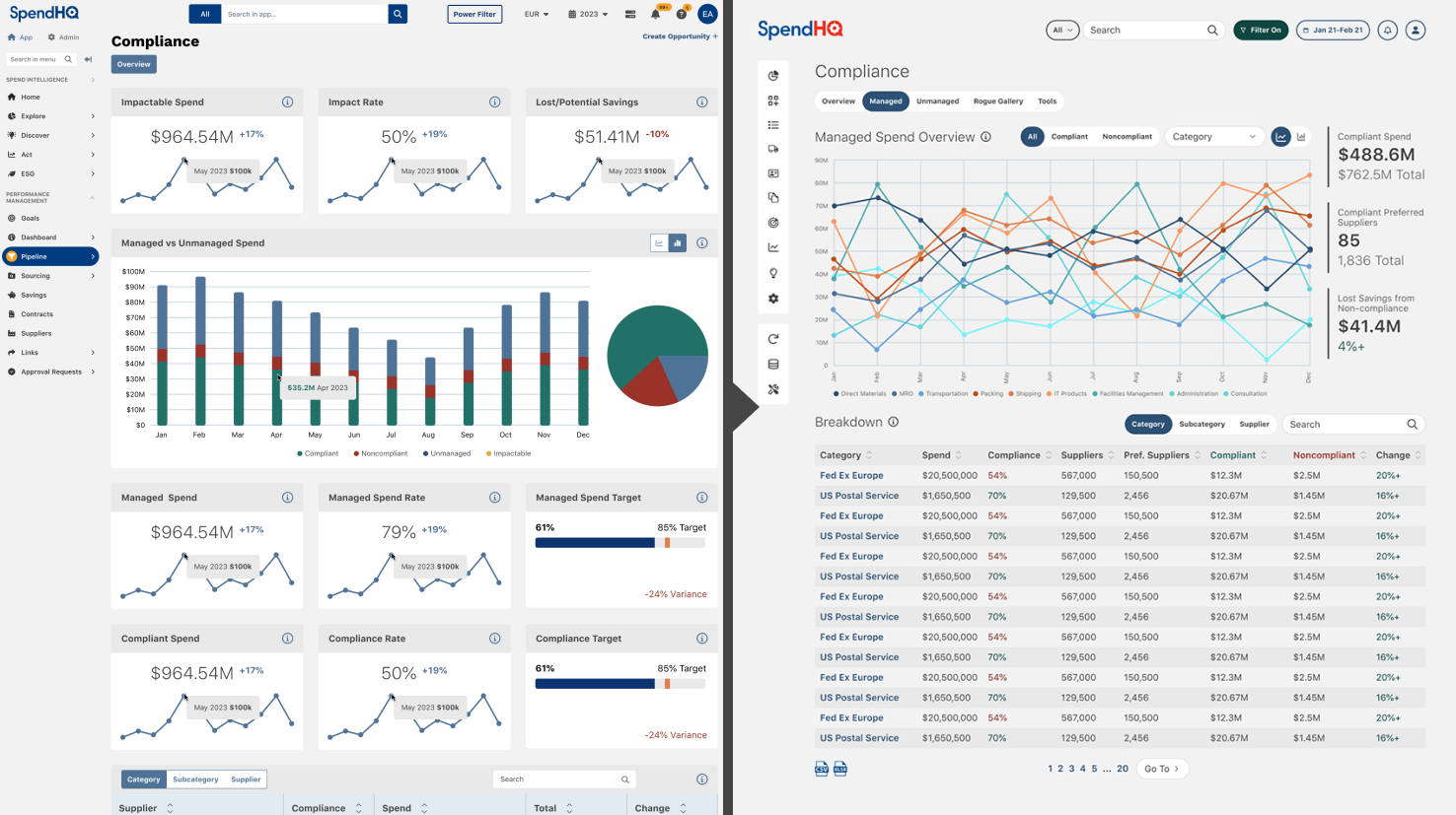
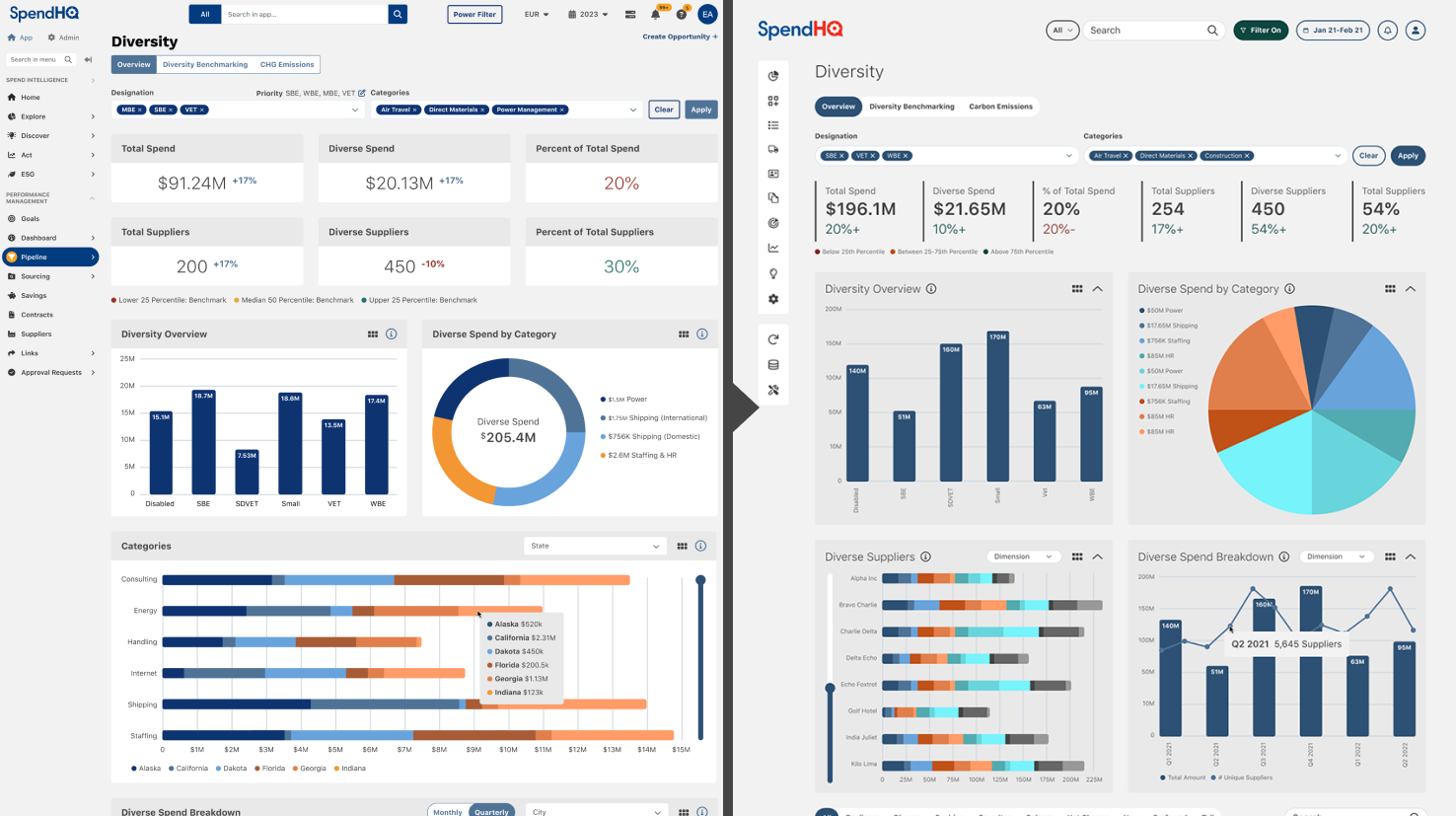
    Diversity ScreenCompliance re-skin and re-design Diversity ScreenDiversity re-skin and re-design
  11. Designed new help pop-overs and documentation UI leveraging first and third-party tools
    • User confusion as to what they were looking at on any given screen was a major problem in the app. Now there exists a call-able help menu tailored to the screen or component they're interacting with
    • Separate documentation accessible through the main menu allowed users and partners to learn the system in a whole new comprehensive space
    DocumentationThird party documentation screenshot, with a help pop-over example
NASCAR

NASCAR

NASCAR is the sanctioning body for stock-car racing in North America, responsible for making stock-car racing a widely popular sport in the United States by the turn of the 21st century.

Accomplishments

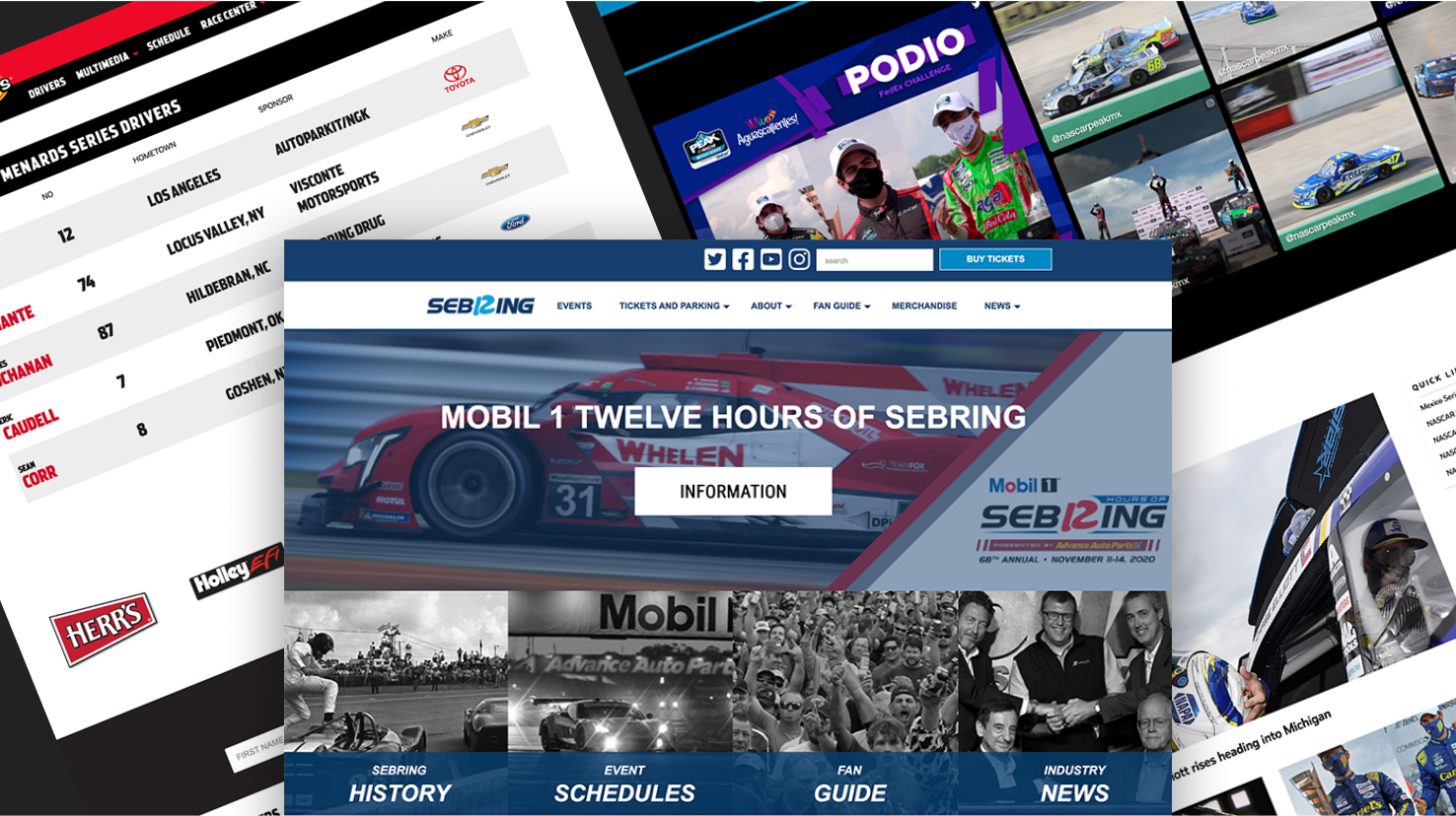
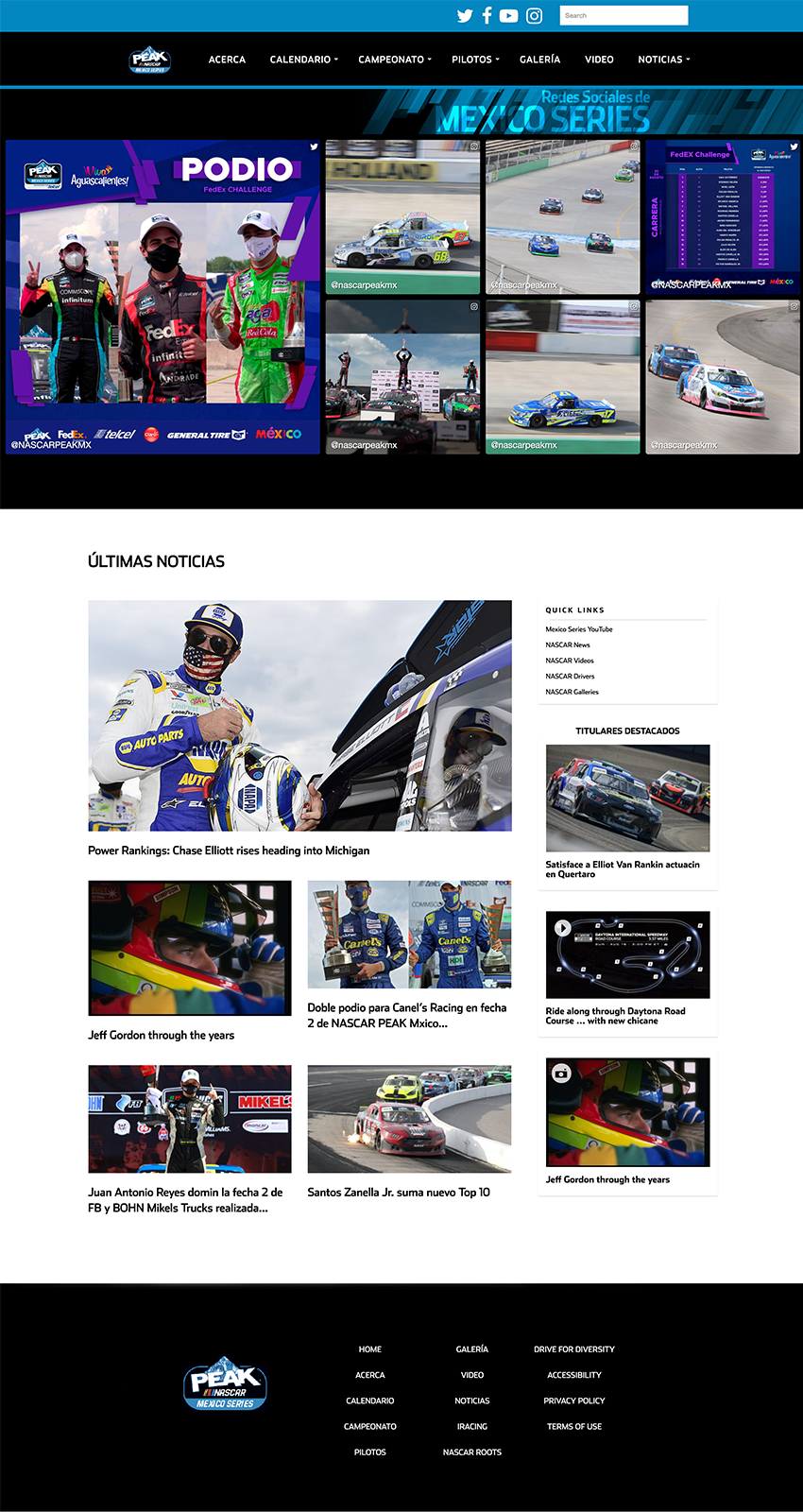
  • New NASCAR Mexico Website
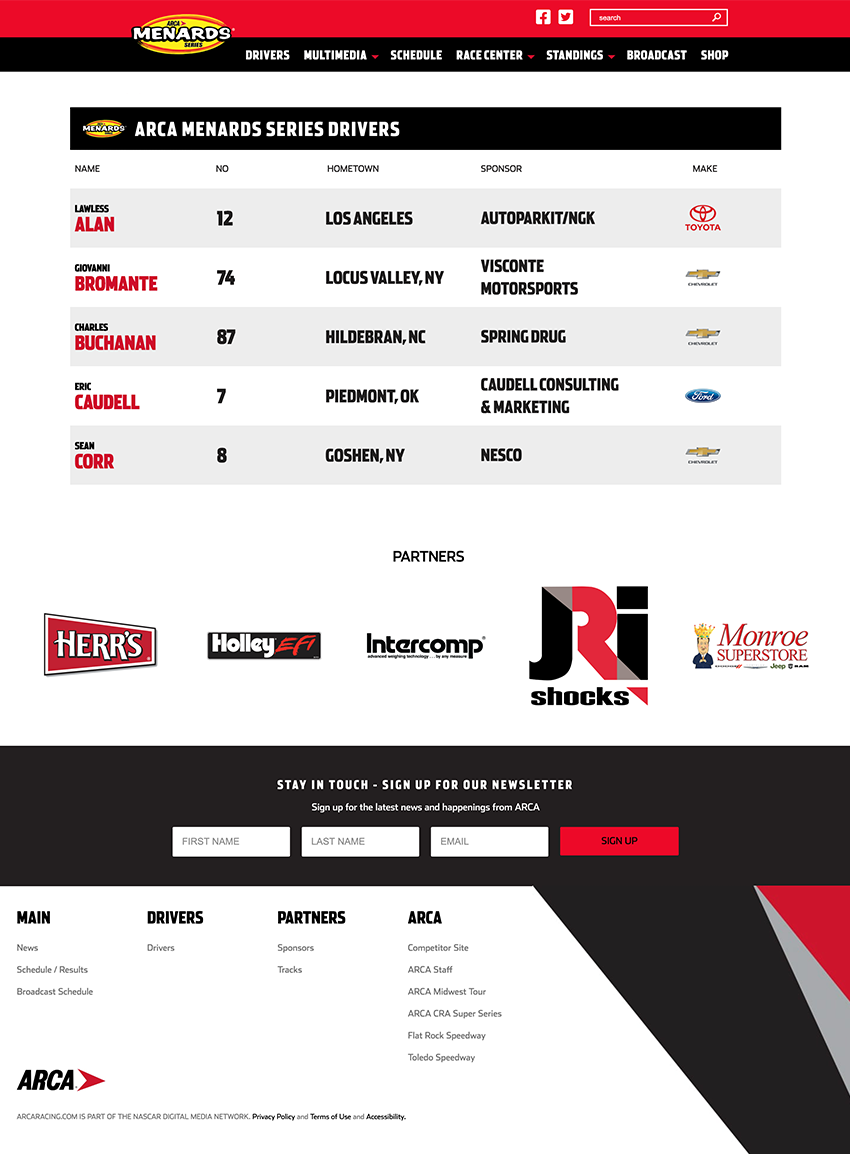
  • New ARCA Menards Website
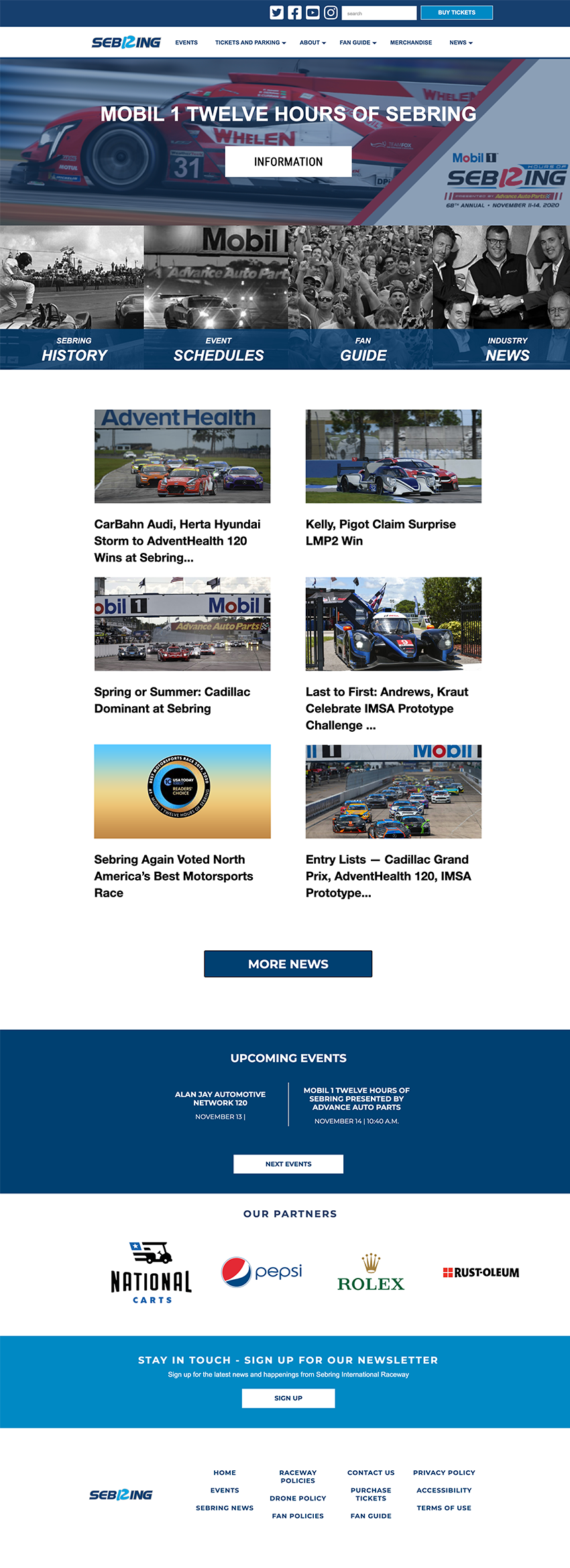
  • New Sebring Raceway Website
  • Enhancements and live monitoring and patching of NASCAR.com
  • Enhancements on IMSA.com

Problem

NASCAR was restructuring from using third-party teams to repurposing internal teams to create the web and mobile app experiences for their properties. Non-PHP/WordPress developers were now building custom WordPress sites, and graphic designers were designing UX/UI experiences.

Solution

Bringing my Wordpress development and UX/UI design experience to the team helped me bridge the gap between the designers and developers, in building and releasing new websites, as well as enhancing the current ones.

Full Solution
  1. Creative briefings with the product manager and assigned graphic designer, informing me of the research findings so that any design modifications were informed
  2. Analyze and consult on site designs, for development in the custom WordPress development system
    • Industry standard UX/UI adherence
    • Accessibility
    • Execution viability on their custom WordPress platform
    ARCA Drivers PageARCA Menards Drivers web page
  3. Build upon, modify, and add to the existing custom WordPress theme and plugins during development
    • Websites I created were exclusively assigned to me
    • I'd work within their Atlassian system (Jira) to update the project as it was built
    Sebring HomepageSebring website
  4. If any issues were found during QA, it would be reassigned to me for bug fixes or requested modifications NASCAR Mexico HomepageNASCAR Mexico website
  5. Monitor live weekend races with a live ops member in the monitoring room in NASCAR headquarters in Charlotte, NC. If anything went wrong with any of our web experiences or features (ie. real-time lap time reporting,) I would develop a solution on the fly
SpendHQ

AMSI

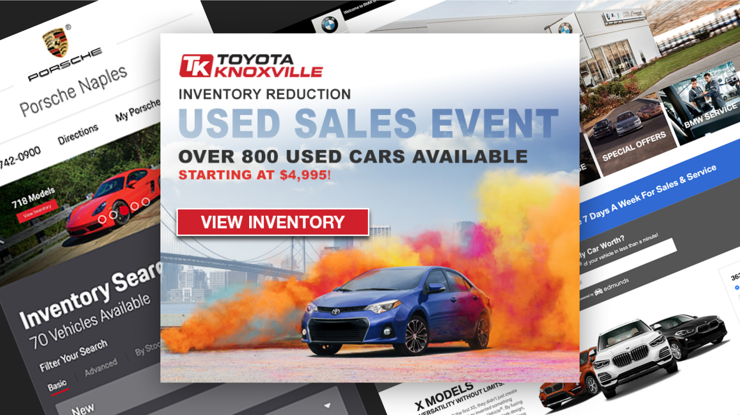
Automotive Management Services Inc. (AMSI) manages and executes all digital advertising for their car dealership clients, including all major car brands from Aston Martin to Volvo.

Accomplishments

  • 400% Increase in Task Efficiency
  • 90% Reduction in Accessibility, Compliance & Coding Issues

Problem

Managing and creating website add-ons, display ads, and email campaigns was hectic, as there was no project management system, and the assets created frequently faced brand compliance, accessibility, and coding errors.

Solution

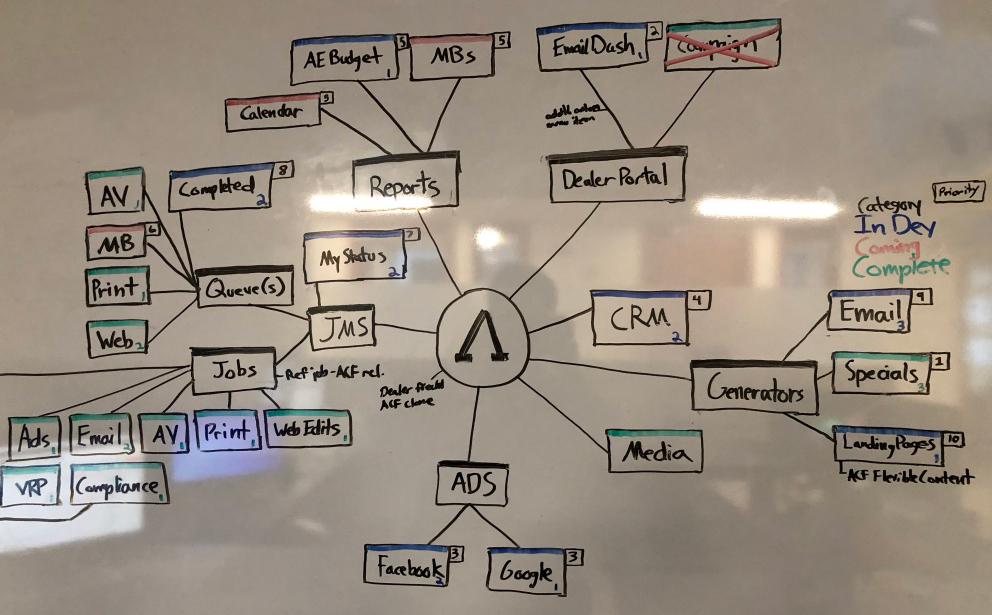
Researching the functions of every position in the agency, I designed and developed the “Phalanx” system to build (drag and drop), generate reports on, and track digital asset projects. Analysis of metrics collected in real-time user testing and internal analytics by the custom WordPress platform allowed measurement of goal completion, time, and quality.

Full Solution
  1. Analyzing the requests sent to us from the clients by the account executives, responding directly to them or with OEM compliance for any questions or additional information about the target audience or goals of their campaigns
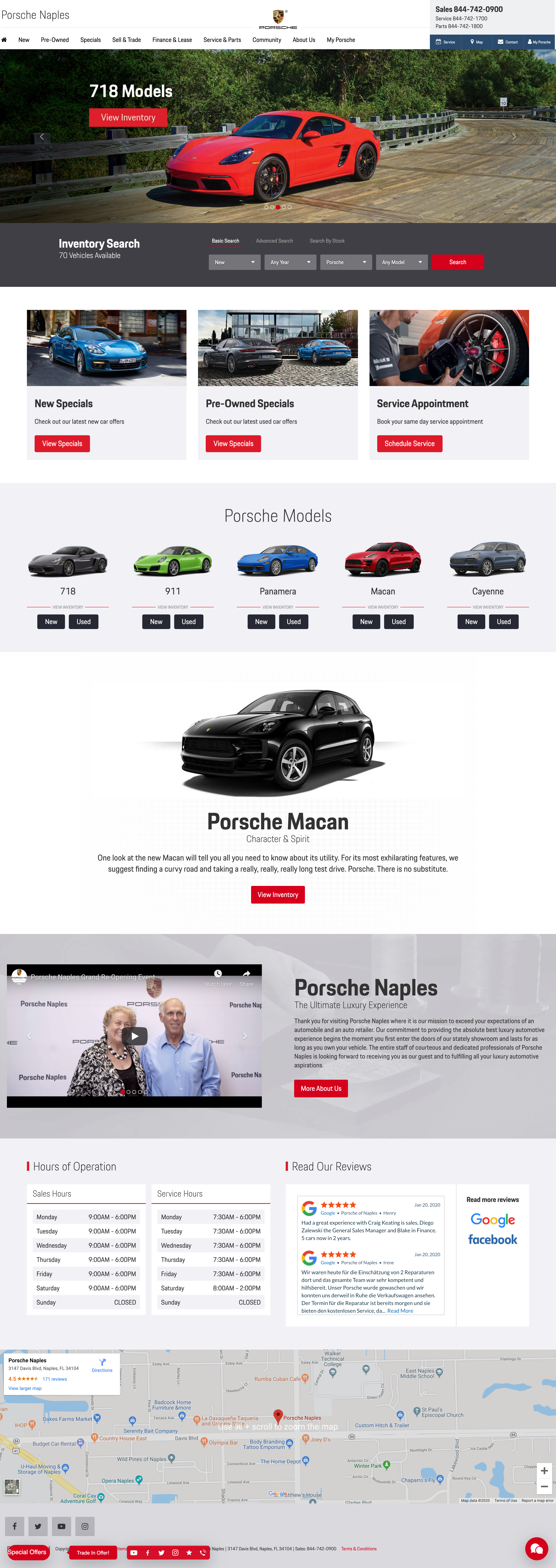
  2. Create a new site, page, ad, or email campaign from scratch if the request was highly custom, or utilize a high-performing template as a boilerplate Porsche Naples Homepage Porsche Naples homepage
  3. Analyze Google Analytics, Visual Web Optimizer, heat mapping, and Campaigner (email) analytics to see what was and was not working
  4. Create a hypothesis, update the assets and template, and review the findings, keeping what worked and eliminating what did not
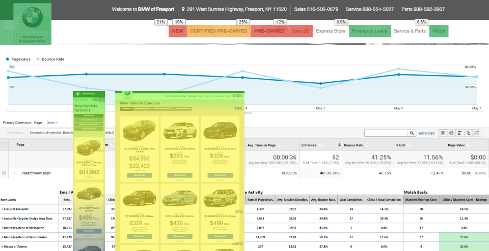
    • One of our biggest projects was the vehicle search modules included as the first and dominant element on their homepages. By looking at the heat mapping and interaction metrics from Google Analytics,

      We determined that there were two primary user groups with the same goal of locating a vehicle but with different approaches. Some already had an idea of the exact make and model they wanted, while others only had a vague idea.

      We implemented and A/B tested variants that allowed drop-down selection for year, make, and model, one that had clickable images indicating make and model (sedan, convertible, SUV, etc.), and a final variant that had both
    • analytics Screenshots from analytics tools
  5. High-fidelity mock-ups were created for deliverables and passed through OEM compliance and the client for approval, built then shipped to the client or deployed on their sites  Lexus Special Special for Lexus dealer website
  6. I noticed that we experienced a lot of coding, accessibility, and responsiveness errors, as well as long development times. Many of the webpages, ads, and email campaigns weren’t properly tested with Litmus, cross-browser tested, or designed based on performance analytics from Google or our email marketing performance metrics
    • Some of these uncaught errors would have heavy consequences for our clients, as some dealers had a three strike limit on OEM compliance violations, with a penalty of losing large amounts of OEM funding
  7. I designed and pitched a concept for a system I would come to design, build and manage called "Phalanx". This system would allow users to input the content and desired design for an email, website add-on, ad, landing pages and other deliverables for assets that were then generated in OEM compliant, error free, and responsive code instantly
  8. Designed and executed user tests for Phalanx directly with the SEO, email, ad, A/V, media buyer, account executive, and management teams
    • I’d have users walk me through how they used the system daily and show me any pain points in their user paths
    • Designed a few tasks for them to complete so that I could see if my designed user paths aligned with their actual goals
  9. Developed Phalanx as a custom WordPress theme with custom plugins
    • Custom component UI library developed with HTML, CSS, Sass, JavaScript, and PHP that Phalanx would generate visual assets for the websites, emails, and display ads
    • If an asset was highly custom, we would create it from scratch, but Phalanx performed at least 90% of the assets

    Phalanx Generated Email

  10. Deliverables were optimized by data from Google Analytics, heat mapping, Visual Web Optimizer, and Campaigner for performance, and built upon frameworks that work across all browsers and email clients
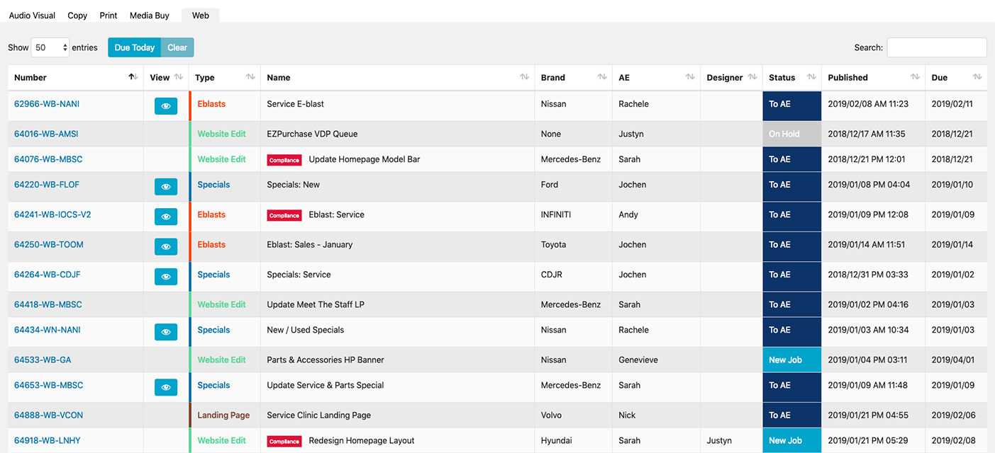
  11. Designed and developed a job management, staff performance reporting, budget reporting, and client relationship management system into Phalanx to accommodate other gaps missing in our overall process
Wick

Wick

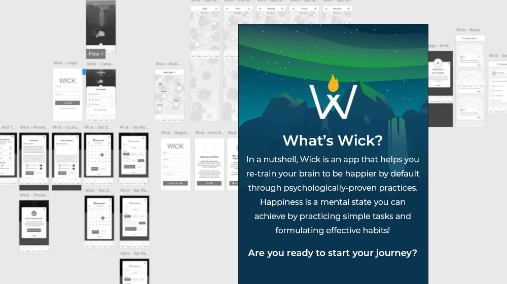
Wick is a mobile app that makes the journey of improving ones well-being a comforting and enjoyable adventure.

Major Accomplishment

  • 100% User Approval Rating of the New Well-being Science Education & Tracking Experience

Problem

Learning and applying the science of well-being is a time-consuming, difficult, and confusing endeavor. It requires learning a large amount of sometimes complicated subject matter and tracking several goals on one’s journey to improved well-being.

Solution

We created a gamified, step-by-step well-being improvement journey and education mobile app. This app breaks down the science into bite-sized, easy-to-understand language and gives weighted rewards for each step taken to learn and apply the science to daily life.

Full Solution
  1. SWOT analysis of the top 25 competing apps in the health and wellness space
    • User experiences and flows
    • Features
      • Noticed a lack of robust gamification, which excited us about filling that niche
      • Encouraged repeat app usage by awarding points for completing tasks (with weighted rewards based on the difficulty of the task) and earning badges. This melded well with the friendly writing tone and positive encouragement throughout the app
    • Visual language
      • We found that most apps employed a similar visual language, primarily using a clean, minimal aesthetic
    • UI patterns
  2. Persona creation
    • Adults 19-40 at all different stages of their well-being journeys
  3. Phone interviews collecting quantitative and qualitative data
    • Current well-being apps used
      • Duration of time used
      • Devices used
      • Likes and dislikes
        • We found they had an overall lack of interest in repetitive and “boring” interactions with the applications they were currently using
      • Overall interest in our mission and app's function
      • What they thought their most important positive habits were, why, and how long they engaged in them

    View User Testing Script

    View User Interview Results

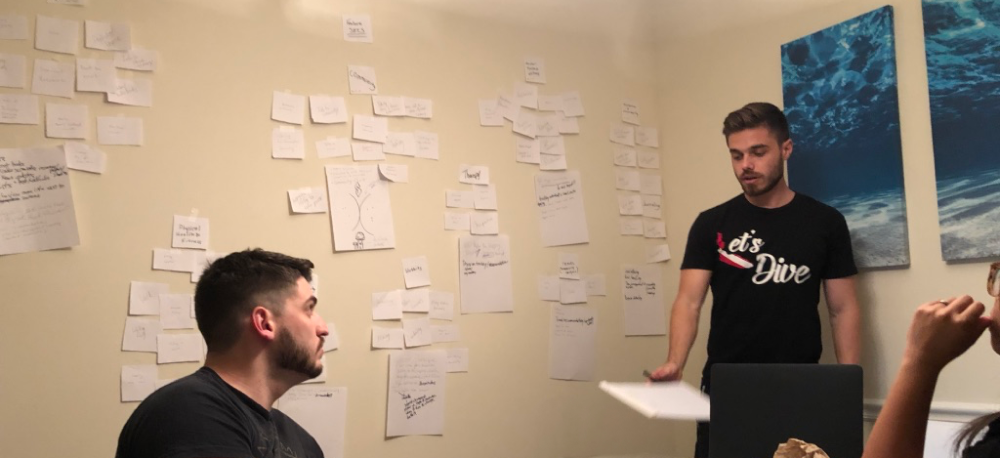
  4. Card sorting and ideation Card Sorting Card sorting session
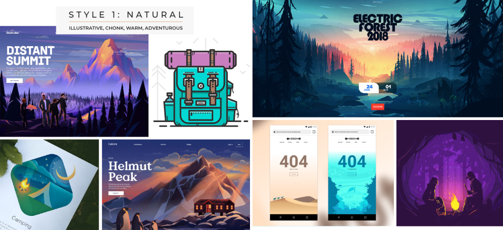
  5. Mood-boarding Moodboard Mood-board example
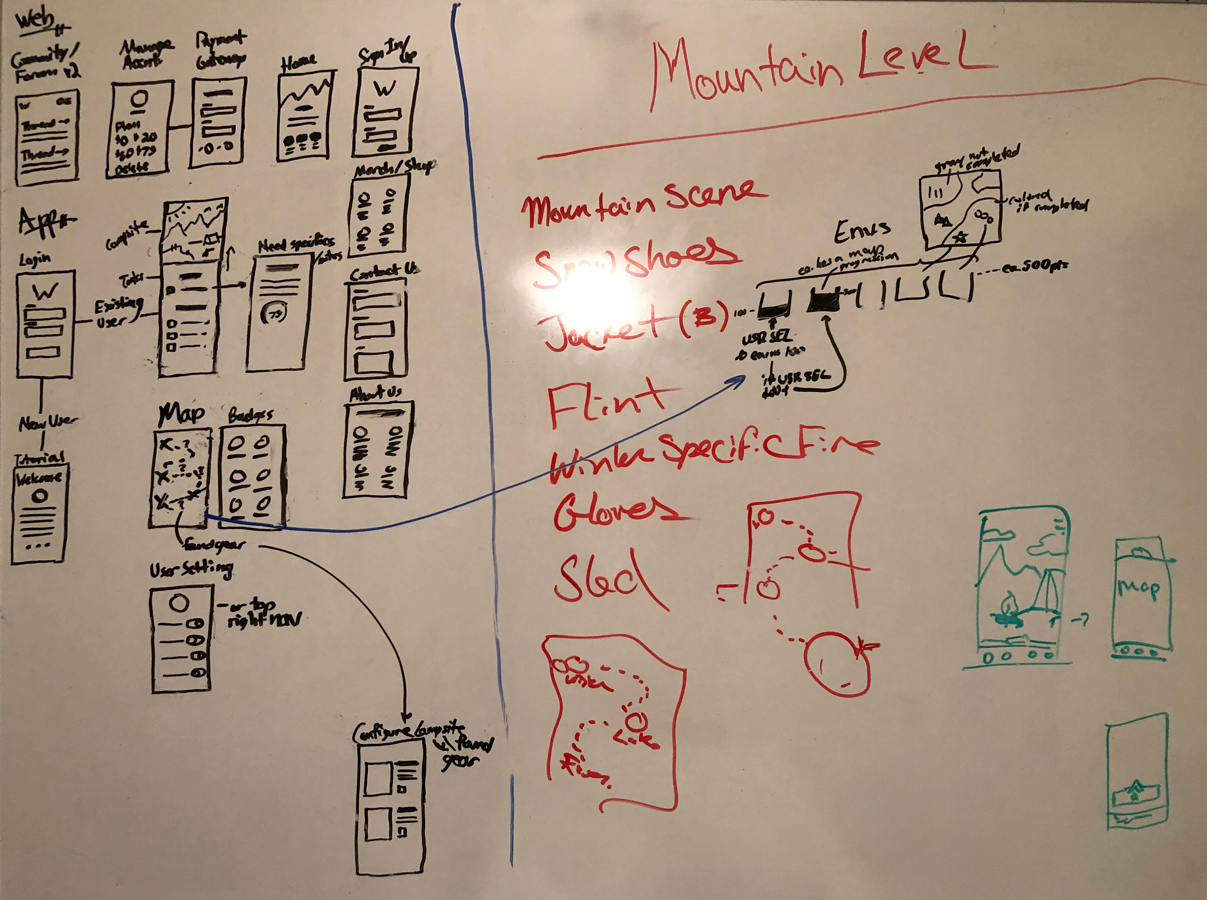
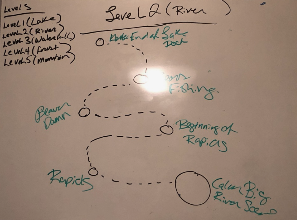
  6. White-boarding flows and wire-frames that accommodated all user personas
    • As gamification introduces complexity into the experience and the app learning process, white-boarding was the best approach, as it is flexible and streamlines the initial design process
    Whiteboarding White-boarding screens Whiteboarding journey White-boarding the gamified user journey
  7. Branding and design system
    • We imagined our app as the torch that accompanied users on their path to self-improvement
      • Incorporated a fire motif into our logo, with the flame resting in the crossed arms of the W, like a fire brazier
      • Wick was a short and catchy name that immediately brought comforting fire to mind
    • Chose a font with an earthy, grounded, and rugged feel
    • The sans-serif font was modern enough for a self-help app, and resembled fonts used in state park assets and signs, such as on hiking trails
    • Feelings of adventure and immersion in nature became our target experience
      • Selected cool greens and blues in contrast to the yellow and orange CTAs to communicate this
      • Illustrated visuals throughout the entire app and iconography related to camping and adventure
    • Language decided on as down-to-earth, comforting, and empathetic

    View Style Guide

  8. Wireframe that incorporated our approved whiteboard designs
  9. Lo-fi prototype developed Lo-fi Screenshot Lo-fi prototype
  10. User feedback and testing of lo-fi prototype
    • Provided many valuable insights as having them step through the app and speak their thoughts aloud revealed pain points that we stamped out before the hi-fi prototype, and also revealed new insights or ideas, some of which were incorporated into the final design
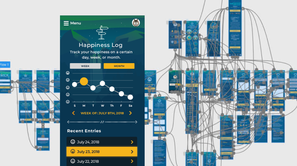
  11. Hi-fi designs and interactive prototype created in Adobe XD
    • Fleshed out every possible user state identified in our lo-fi prototype testing and brought it to life using our established visual language
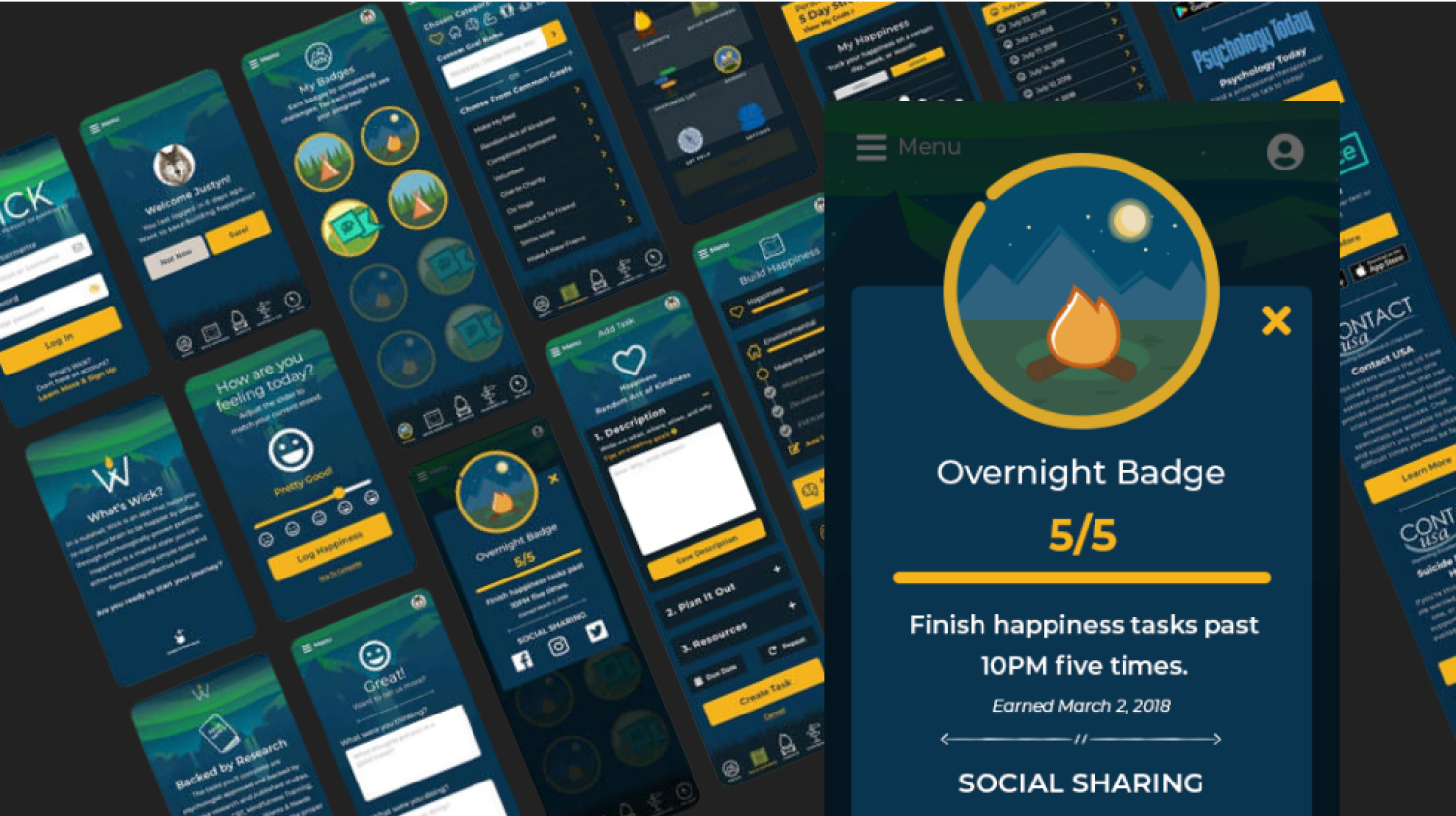
    Prototype Hi-fi prototype
  12. User test with hi-fi prototype
    • Utilized our existing research group to compare results to an established user base
    • All users agreed that they enjoyed the journey format of the app and that they preferred our experience over the other apps they were currently using on their well-being journey

    View Adobe XD Prototype

Want More?

View my full list of 18 years of work experience, skills, and certs on LinkedIn, or send me an email